Fighting Hunger in Australia (H1)
Fighting Hunger in Australia (H2)
Fighting Hunger in Australia (H3)
Fighting Hunger in Australia (H4)
Fighting Hunger in Australia (H5)
Fighting Hunger in Australia (H6)
Here is some paragraph copy. Lorem ipsum dolor sit amet, consectetur adipiscing elit, sed do eiusmod tempor incididunt ut labore et dolore magna aliqua. Ut enim ad minim veniam, quis nostrud exercitation ullamco laboris nisi ut aliquip ex ea commodo consequat. Duis aute irure dolor in reprehenderit in voluptate velit esse cillum dolore eu fugiat nulla pariatur. Excepteur sint occaecat cupidatat non proident, sunt in culpa qui officia deserunt mollit anim id est laborum.
- You can create bullet lists
- Here is another bullet
- And another bullet
- You can also create numbered lists
- Here’s another number
- And another number
Links will display in bold in purple
Here is an important quote. Lorem ipsum dolor sit amet, consectetur adipiscing elit, sed do eiusmod tempor
Here is some purple text
Here is some teal text
Here is white
text selection. Here is some paragraph copy. Lorem ipsum dolor sit amet, consectetur adipiscing elit, sed do eiusmod tempor incididunt ut labore et dolore magna aliqua. Ut enim ad minim veniam, quis nostrud exercitation ullamco laboris nisi ut aliquip ex ea commodo consequat. Duis aute irure dolor in reprehenderit in voluptate velit esse cillum dolore eu fugiat nulla pariatur. Excepteur sint occaecat cupidatat non proident, sunt in culpa qui officia deserunt mollit anim id est laborum.
Caption text here aligned left
Caption text here aligned center
Caption text here aligned right
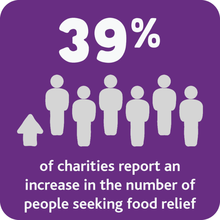
Style 2
Featured tiles style 2 where you can add additional text underneath
Featured tiles allow you to add an image and a link to the relevant page for more information. There are two styles. Style 2 allows additional text information at the bottom of the image.
Note that both styles have a button CTA. The CTA is extremely important as it gives the user some direction on what action to do next.
Here is what an accordion section looks like when it’s open. When an accordion is closed it looks like the below purple rows.
Lorem ipsum dolor sit amet, consectetur adipiscing elit, sed do eiusmod tempor incididunt ut labore et dolore magna aliqua. Ut enim ad minim veniam, quis nostrud exercitation ullamco laboris nisi ut aliquip ex ea commodo consequat. Duis aute irure dolor in reprehenderit in voluptate velit esse cillum dolore eu fugiat nulla pariatur.
Here is some paragraph copy. Lorem ipsum dolor sit amet, consectetur adipiscing elit, sed do eiusmod tempor incididunt ut labore et dolore magna aliqua. Ut enim ad minim veniam, quis nostrud exercitation ullamco laboris nisi ut aliquip ex ea commodo consequat. Duis aute irure dolor in reprehenderit in voluptate velit esse cillum dolore eu fugiat nulla pariatur. Excepteur sint occaecat cupidatat non proident, sunt in culpa qui officia deserunt mollit anim id est laborum.
Here is some paragraph copy. Lorem ipsum dolor sit amet, consectetur adipiscing elit, sed do eiusmod tempor incididunt ut labore et dolore magna aliqua. Ut enim ad minim veniam, quis nostrud exercitation ullamco laboris nisi ut aliquip ex ea commodo consequat. Duis aute irure dolor in reprehenderit in voluptate velit esse cillum dolore eu fugiat nulla pariatur. Excepteur sint occaecat cupidatat non proident, sunt in culpa qui officia deserunt mollit anim id est laborum.
The above component is an accordion. You can use this to group information in a more condensed form. When clicking on a title, it expands to reveal the information.
This is a campaign banner. You can add some text here to provide details.
You can also add links to direct the user to more information Learn more
There are two gradients that can be used. This is the black gradient.
This is a campaign banner. You can add some text here to provide details.
You can also add links to direct the user to more information Learn more
There are two gradients that can be used. This is the white gradient.
Here is a carousel component. There is a setting that allows you to display the images in a random order.
This is your gallery of photos. Images can be displayed in a number of columns. There are options to have 1, 2, 3, 4 or 6 columns!
The above component is a bio card. You add a small description of the subject. When hovering over the ‘More’ link, the card will flip over to reveal more details.
When taking an image of a team member, it is preferred for the photo to be taken in front of a light grey background.
These partner cards can be used to display your partner details, including address, phone number and a link to their homepage.
| Where: | Where the event is |
|
|---|---|---|
| When: | DD/MM/YYYY |
|
| Name of the event | Description of the event. You can contact us here: info@foodbank.org.au. | |
The table above is specifically for events. Details of the event are placed here and a map location is also linked from the ‘View Location’ button.
The 3rd row (shown as “Name of the event”) above is also editable.
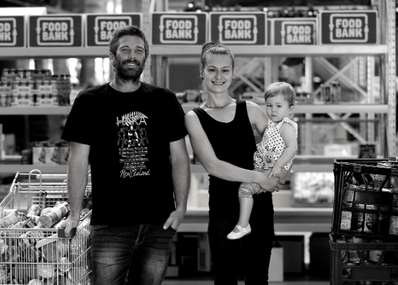
This is the image with content option. Here is some paragraph copy. Lorem ipsum dolor sit amet, consectetur adipiscing elit, sed do eiusmod tempor incididunt ut labore et dolore magna aliqua. Ut enim ad minim veniam, quis nostrud exercitation ullamco laboris nisi ut aliquip ex ea commodo consequat. Duis aute irure dolor in reprehenderit in voluptate velit esse cillum dolore eu fugiat nulla pariatur. Excepteur sint occaecat cupidatat non proident, sunt in culpa qui officia deserunt mollit anim id est laborum.

This is an image with the content on the left side. Here is some paragraph copy. Lorem ipsum dolor sit amet, consectetur adipiscing elit, sed do eiusmod tempor incididunt ut labore et dolore magna aliqua. Ut enim ad minim veniam, quis nostrud exercitation ullamco laboris nisi ut aliquip ex ea commodo consequat. Duis aute irure dolor in reprehenderit in voluptate velit esse cillum dolore eu fugiat nulla pariatur. Excepteur sint occaecat cupidatat non proident, sunt in culpa qui officia deserunt mollit anim id est laborum.
This is an image with the content on the right side. Here is some paragraph copy. Lorem ipsum dolor sit amet, consectetur adipiscing elit, sed do eiusmod tempor incididunt ut labore et dolore magna aliqua. Ut enim ad minim veniam, quis nostrud exercitation ullamco laboris nisi ut aliquip ex ea commodo consequat. Duis aute irure dolor in reprehenderit in voluptate velit esse cillum dolore eu fugiat nulla pariatur. Excepteur sint occaecat cupidatat non proident, sunt in culpa qui officia deserunt mollit anim id est laborum.

The text links above come with an icon.
An in-page state selector filters the content according to state.
The panels have the following width options.
- Full
- 5/6
- 2/3
- 3/4
- 7/12
- 1/2
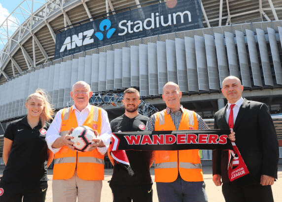
The above is a visual asset in image form. Below we have a video form.
This is a logo gallery. You can choose to include or exclude logos based on state.
 Contact us
 Log in
